
Hi! This is Krypton.
I created own chart which I use with R
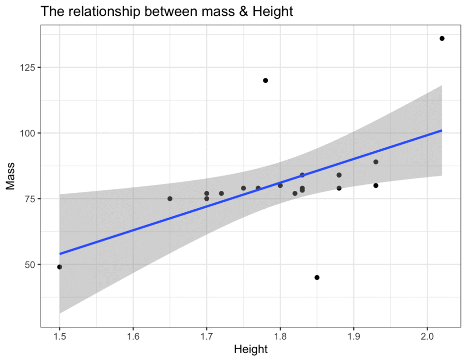
The Chart is below.

This is my code.
library(tidyverse)
view(starwars)

names(starwars)

data1 <- starwars %>%
  select(height, mass, species) %>%
  filter(species =="Human") %>%
  mutate(height = height/100) %>%
  drop_na() %>%
  view()

ggplot(data1, aes(height, mass))+
  geom_point()+
  geom_smooth(formula = y ~ x, method ="lm")+
  labs(x = "Height",
       y = "Mass",
       title = "The relationship between Mass & Height")+
  theme_bw()
Use packages
Both of two codes describe what packages and show data-set what I will use.
For instance, First row is to use “tidyverse” package, second row is to view what “starwars” data-set.
library(tidyverse)
view(starwars)
Check starwars columns
names() describe name of columns, In this case, it shows what the columns of “starwars-datasets”
names(starwars)Clean starwars-dataset
data1 is dataset which I want to create.
Also, “<-” is substitution operator in R.
select() extract the data in the target column using .
filter() take out what “species” is “Human”.
The mutate() function converts height data by dividing it by 100.
drop_na() removes missing values.
data1 <- starwars %>%
  select(height, mass, species) %>%
  filter(species =="Human") %>%
  mutate(height = height/100) %>%
  drop_na() %>%
  view()
Visualise data-1
After that, I visualised the data to use the ggplot package.
ggplot() is define what data is used and what data is used for the x- and y-axes respectively.
In this case, data1 is what I use for visualising data, height is x-axes, mass is y-axes.
geom_point() declares that the data is to be placed.
geom_smooth() draws smooth lines. It helps to highlight general trends amongst the scatter of data.
labs() draws labels.
For instance, Height is placed on the x-axis, Mass on the y-axis and The relationship between Mass & Height is depicted in the title.
theme_bw() is one of ggplot theme, it can change the design of chart.
ggplot(data1, aes(height, mass))+
  geom_point()+
  geom_smooth(formula = y ~ x, method ="lm")+
  labs(x = "Height",
       y = "Mass",
       title = "The relationship between Mass & Height")+
  theme_bw()
The result
I did it!
I created the smooth-chart!!
Thank you for reading at last.