Hi, I’m Krypton.
I created a chart showing the relationship between UK GDP and personal consumption with R. This article demonstrates how I generated and programmed the R code.
Here is my code with R.
#install.packages("ggrepel")
#install.packages("WDI")


library(WDI)
library(ggrepel)
library(tidyverse)


#Create data
data_UK <- WDI(country = "GB",
               indicator = c("NY.GDP.MKTP.CD","NE.CON.PRVT.CD"),
               start = 2014, end = 2024)

view(data_UK)


names(data_UK)[c(5, 6)] <- c("GDP/billion", "Consumption/billion")

data_UK_1 <- data_UK %>%
    mutate(`GDP/billion` = `GDP/billion`/1000000000*0.747,
           `Consumption/billion` = `Consumption/billion`/1000000000*0.747)


cor_value <- cor(data_UK$GDP, data_UK$Consumption, use = "complete.obs")
print(paste("Correlation Coefficient:", cor_value))

ggplot(data_UK_1, aes(x = `Consumption/billion`, y = `GDP/billion`, label = year)) +
    geom_point(col = "blue") +
    scale_x_continuous(
        breaks = seq(1000, 4000, by = 100),
        labels = paste0("£", seq(1000, 4000, by = 100))
    ) +
    scale_y_continuous(
        breaks = seq(1000, 4000, by = 200),
        labels = paste0("£", seq(1000, 4000, by = 200))
    ) +
    geom_smooth(method = "lm", ) +
    geom_text_repel(col = "darkblue") +
    labs(x = "Personal Consumpation/billion(GBP)",
         y = "GDP/billion(GBP)",
         title = "Correlation: UK GDP vs Private Consumption",
         subtitle = "Data source: World Bank (2000-2024), values in billions",
         caption = "The correlation coefficient is 0.89.") +
    theme_bw()

# 1 USD = 0.747 GBP
Install packages and use packages.
The WDI packages is data set which comes from the World Bank.
The ggrepel is a packaging designed to prevent labels indicating the number of years from overlapping.
The tidyverse is a set of packages that makes it easy to generate graphs and tidy up data.
#install.packages("ggrepel")
#install.packages("WDI")


library(WDI)
library(ggrepel)
library(tidyverse)
Read and Compile data-sets
Read WDI data set and extract GDP data and Personal Consumption data.
In this case, I used the data from the UK.
* The original data was calculated in USD, so I converted the dataset from USD to GBP.
*1USD = 0.747 GBP.(3_Mar_2026)
*To make the notation clearer, it has been changed to units of one billion.
#Create data
data_UK <- WDI(country = "GB",
               indicator = c("NY.GDP.MKTP.CD","NE.CON.PRVT.CD"),
               start = 2014, end = 2024)

view(data_UK)


names(data_UK)[c(5, 6)] <- c("GDP/billion", "Consumption/billion")

data_UK_1 <- data_UK %>%
    mutate(`GDP/billion` = `GDP/billion`/1000000000*0.747,
           `Consumption/billion` = `Consumption/billion`/1000000000*0.747)
Calculate the correlation coefficient.
This code is calculated the correlation coefficient.
The result is therefore 0.89.
cor_value <- cor(data_UK$GDP, data_UK$Consumption, use = "complete.obs")
print(paste("Correlation Coefficient:", cor_value))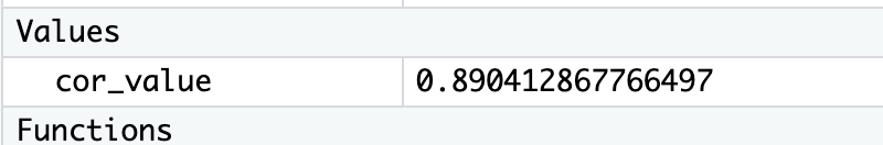
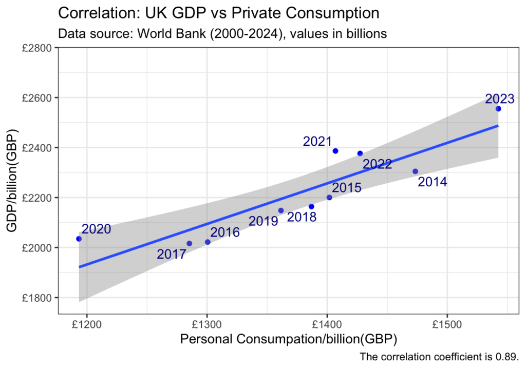
Create the Graph with ggplot
ggplot(data_UK_1, aes(x = `Consumption/billion`, y = `GDP/billion`, label = year)) +
    geom_point(col = "blue") +
    scale_x_continuous(
        breaks = seq(1000, 4000, by = 100),
        labels = paste0("£", seq(1000, 4000, by = 100))
    ) +
    scale_y_continuous(
        breaks = seq(1000, 4000, by = 200),
        labels = paste0("£", seq(1000, 4000, by = 200))
    ) +
    geom_smooth(method = "lm", ) +
    geom_text_repel(col = "darkblue") +
    labs(x = "Personal Consumpation/billion(GBP)",
         y = "GDP/billion(GBP)",
         title = "Correlation: UK GDP vs Private Consumption",
         subtitle = "Data source: World Bank (2000-2024), values in billions",
         caption = "The correlation coefficient is 0.89.") +
    theme_bw()
The Result
I made it !!
It can be seen that there is a strong positive correlation between personal consumption and the size of GDP.
The R language is a great choice for analysing data and creating beautiful graphs.
Thank you for reading at the end.